1. Why Face Proportions Matter in Realistic Portraits
If you’ve ever drawn a portrait where something felt wrong but you couldn’t name it, chances are the issue was proportion and placement, not shading. You can render skin beautifully and blend like a master, but if the eyes sit too high, the nose is too long, or the mouth floats in the wrong place, the viewer’s brain will immediately feel that the face is “off.”
The good news: realistic portraits don’t start with talent—they start with a small set of measurable relationships on the human face. Artists and instructors consistently teach a handful of core rules:
- The eyes sit halfway down the head.
- The face divides vertically into three equal thirds.
- The width of the face can be thought of as five eye widths.
These are averages, not rigid laws, but they give you a solid scaffold. Once you internalise them, you can bend and break them consciously instead of guessing.
2. The Big Picture: Head Shape and Basic Divisions
Before you worry about eyelashes or lip highlights, you need a solid head construction.
2.1. Overall head shape
Several contemporary drawing resources suggest thinking about the head like this:
- From the front view, the face typically fits into a slightly tall 4:3 rectangle (height a bit greater than width).
- From the side view, the head roughly fits a square: the distance from the nose tip to the back of the skull is similar to the distance from the top of the skull to the bottom of the chin.
This gives you a bounding box so you’re not floating features in space.
2.2. The Loomis “three equal segments” idea
The Loomis method, widely used in portrait training, divides the face vertically into three equal parts: forehead, nose, and mouth/chin:
- Segment 1: Hairline → Brow line (forehead).
- Segment 2: Brow line → Base of the nose.
- Segment 3: Base of the nose → Bottom of the chin (including mouth and chin).
This “rule of thirds” for the face shows up in multiple teaching systems and is a powerful anchor for feature placement.
3. Horizontal Proportions: Eyes, Nose, Mouth, and Ears
Let’s break down where each feature goes, using common proportion guidelines.
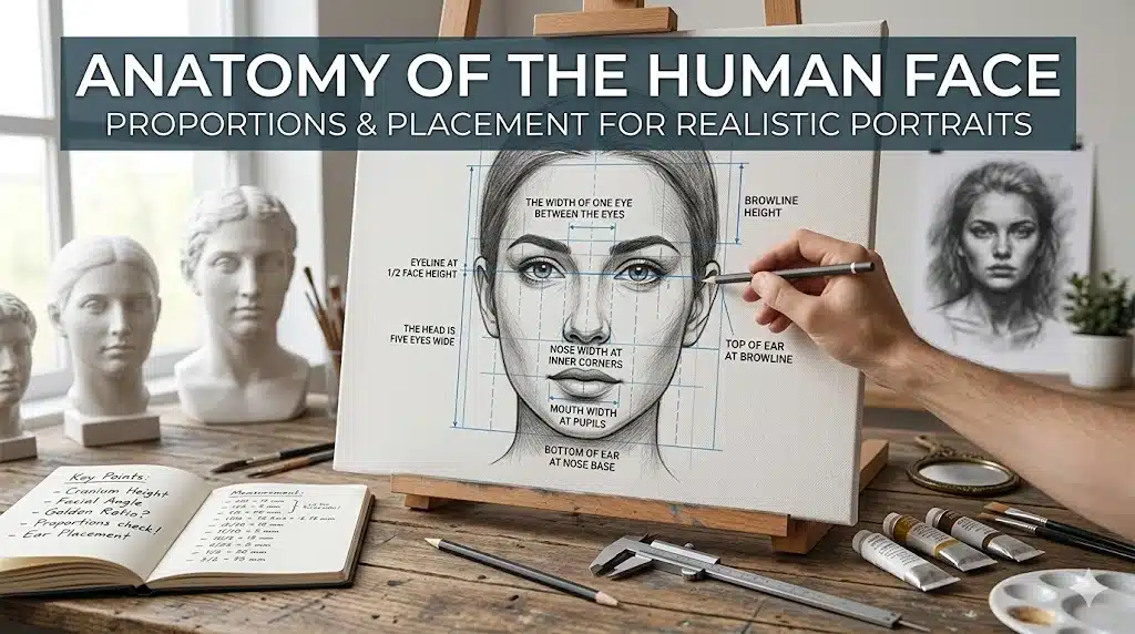
3.1. Eyes: halfway down and five across
A foundational rule: the eyes sit halfway down the head, not in the upper third like many beginners assume.
From there:
- The width of one eye typically fits five times across the face: Eye – space – eye – space – eye (eye widths 1, 2, 3, 4, 5).
- The space between the eyes is roughly the width of one eye.
So if you draw the face’s width and mark five equal segments, you get: Eye in segment 1, Eye in segment 3, and the Middle segment (2) is the spacing between them. This simple breakdown is confirmed again and again in portrait proportion guides and Loomis‑based tutorials.
3.2. Nose: width and vertical placement
Using the thirds and eye spacing, you can place the nose with confidence:
- The base of the nose (bottom plane) typically falls at the boundary between the second and third facial thirds (brow → nose, nose → chin).
- The width of the nose usually lines up with the inner corners of the eyes (the tear ducts). If you drop vertical lines from each inner eye corner, they roughly mark the sides of the nose.
Some sources phrase this as: “The width of the nose is about equal to the distance between the eyes,” which echoes the eye‑width logic. The bridge of the nose begins at the brow ridge, then runs down to the base; understanding this continuous structure helps keep the nose from feeling pasted on.
3.3. Mouth: aligning with nose and eyes
The mouth sits in the lower third of the face (between base of nose and chin). Loomis‑based resources refine this further:
Divide the space from the base of the nose to the bottom of the chin into three equal parts:
- Top third: philtrum (the groove under the nose).
- Middle third: bulk of the lips.
- Bottom third: chin mass.
Horizontally, the corners of the mouth often align roughly under the pupils when the face is relaxed and looking straight ahead. This isn’t exact for every person, but dropping a vertical from each pupil gives a reliable starting point for mouth width.
3.4. Ears: between brow and nose
The ears are often misplaced or sized wrong in beginner portraits. Use the vertical thirds to fix that:
- The top of the ear aligns roughly with the brow line or slightly above.
- The bottom of the ear aligns roughly with the base of the nose.
This relationship holds for front and three‑quarter views, though the visible shape and foreshortening change with angle.
4. Vertical Proportions: The Three Facial Thirds in Practice
Re‑emphasising the vertical thirds because they’re so important:
- Hairline to eyebrows (forehead).
- Eyebrows to base of the nose.
- Base of the nose to bottom of the chin.
A video guide notes that dividing the face into these three equal sections helps place eyes, nose, and mouth accurately and keep a natural, balanced look. Loomis and related methods use this framework both in front view and when adapting to different angles and ages. Within the lowest third (nose to chin), you then add smaller divisions for the mouth and chin, as mentioned above.
5. Putting It Together: A Simple Construction Sequence
Here’s a streamlined front‑view construction process, synthesising common steps across Loomis and modern tutorials.
5.1. Draw the head shape
Start with an oval or slightly tall 4:3 rectangle to define the face’s outer boundary. Lightly mark the vertical centre line (split left and right) and a horizontal line halfway down the head (eye level).
5.2. Mark the eye line and eye spacing
On the halfway line, mark five equal segments across the width. Place the eyes in segment 1 and 3 (outer shapes inside the outer boundaries), leaving one “eye‑width” gap between them.
5.3. Divide the face into thirds vertically
From the top of the head to the bottom of the chin, mark: Hairline, brow, base of nose, chin. Ensure brow → nose → chin segments are approximately equal.
5.4. Place the nose
On the “base of nose” line, drop verticals from the inner corners of the eyes to find the approximate nose width. Sketch the ball of the nose and nostrils between these marks.
5.5. Divide the lower third for the mouth and chin
From base of nose to chin, divide into three equal parts. Use the upper division for the philtrum, the middle for the lips, and the lowest for the chin.
5.6. Place the mouth width
Drop vertical lines from each pupil; this roughly marks where the corners of the mouth should land. Sketch the mouth shape within that width, centred on a line one‑third to halfway down the lower third.
5.7. Add ears
Mark the top of the ears near the brow line and the bottom near the base of the nose. Adjust for tilt or expression later.
5.8. Refine forms, then add anatomy and expression
Once the scaffolding is in place, refine features, add volume to cheeks, jaw, and forehead, and incorporate individual variation. This construction is not about creating a generic robot face; it’s about locking in believable structure so likeness and expression have a solid base.
6. Common Proportion Mistakes (and How These Rules Fix Them)
Teaching resources highlight a few consistent issues beginners face:
| Mistake | Correction Strategy |
|---|
| Eyes too high on the head | Remember eyes sit halfway down the total head height. |
| Nose too long, mouth too low | Use the three equal vertical thirds; base of nose at 2/3. |
| Eyes too big or spacing off | Enforce the five eye widths across rule and one‑eye‑width gap. |
| Mouth floating in space | Use pupil alignment for mouth corners and split the lower third. |
| Ears in the wrong place | Anchor them between brow and nose height. |
When you get in the habit of quickly checking these relationships, your portraits become more consistent and “believable” even before detailed rendering.
7. Adapting Proportions for Different Ages and Faces
Real faces deviate from the ideal. However, the classic rules still give a neutral starting point you can then adjust.
7.1. Age differences
- Children: Larger cranium relative to face. Eyes appear slightly lower on the skull. The thirds are not perfectly equal; lower face can be shorter.
- Older adults: Features may “settle”: nose and ears can appear longer, the jaw softens. Creases alter perceived proportions, but the scaffolding still helps keep structure.
7.2. Individual variation
Some faces have wider noses, fuller mouths, or varying hairlines. Use the rules as a baseline, then consciously adjust by comparing your drawing to the reference: measure how many “eye widths” actually span a given face or how deep the chin really is.
8. Practical Training: Drills to Internalise Face Proportions
To make these proportions automatic, treat them like scales for a musician.
8.1.1. 10 heads from imagination, every day
Quickly draw 10 front‑view heads using the rectangle + thirds + fifths approach. Don’t fuss about likeness—focus purely on getting relationships consistent. Occasionally flip the page or canvas to check for symmetry issues.
8.1.2. Landmark tracing over photos
Take reference photos and trace the main proportional lines on a transparent layer: Eye halfway line, three vertical thirds, five eye widths, pupil‑to‑mouth verticals. You’ll quickly see how real faces cluster around these averages.
8.1.3. Loomis head from different angles
Use Loomis‑based head construction tutorials to practice drawing the head at 3/4, profile, and tilted views while preserving the thirds and eye line logic.
9. When to Break the Rules
Once you know the anatomy and average proportions, you’re free to stylise:
- Caricature: exaggerate one or more measurements while keeping others grounded.
- Stylised realism: nudge proportions for a specific mood (e.g., larger eyes for a youthful look).
- Expression‑driven distortion: stretch or compress features to emphasise emotion.
But because you’ve internalised the “Anatomy of the Human Face” scaffold, your exaggerations will feel intentional, not accidental.
10. Summary: Proportions as Your Portrait GPS
Realistic portraits don’t come from guessing. They come from a simple, repeatable map:
- Head fits a slightly tall rectangle; eyes sit halfway down.
- Face divides into three equal vertical thirds: hairline–brow, brow–nose, nose–chin.
- Across the width, think of five eye widths; the eyes occupy the first and third, with one eye‑width between them.
- Nose width aligns near the inner corners of the eyes; mouth corners sit around pupil verticals.
- Ears nest between brow and base of nose.
Once this map is in your muscle memory, you’re free to concentrate on what makes each face itself: subtle asymmetries, expression, character, and light. That is where portraits stop looking generic and start looking alive.
1. Why Face Proportions Matter in Realistic Portraits
If you’ve ever drawn a portrait where something felt wrong but you couldn’t name it, chances are the issue was proportion and placement, not shading. You can render skin beautifully and blend like a master, but if the eyes sit too high, the nose is too long, or the mouth floats in the wrong place, the viewer’s brain will immediately feel that the face is “off.”
The good news: realistic portraits don’t start with talent—they start with a small set of measurable relationships on the human face. Artists and instructors consistently teach a handful of core rules:
- The eyes sit halfway down the head.
- The face divides vertically into three equal thirds.
- The width of the face can be thought of as five eye widths.
These are averages, not rigid laws, but they give you a solid scaffold. Once you internalise them, you can bend and break them consciously instead of guessing.
2. The Big Picture: Head Shape and Basic Divisions
Before you worry about eyelashes or lip highlights, you need a solid head construction.
2.1. Overall head shape
Several contemporary drawing resources suggest thinking about the head like this:
- From the front view, the face typically fits into a slightly tall 4:3 rectangle (height a bit greater than width).
- From the side view, the head roughly fits a square: the distance from the nose tip to the back of the skull is similar to the distance from the top of the skull to the bottom of the chin.
This gives you a bounding box so you’re not floating features in space.
2.2. The Loomis “three equal segments” idea
The Loomis method, widely used in portrait training, divides the face vertically into three equal parts: forehead, nose, and mouth/chin:
- Segment 1: Hairline → Brow line (forehead).
- Segment 2: Brow line → Base of the nose.
- Segment 3: Base of the nose → Bottom of the chin (including mouth and chin).
This “rule of thirds” for the face shows up in multiple teaching systems and is a powerful anchor for feature placement.
3. Horizontal Proportions: Eyes, Nose, Mouth, and Ears
Let’s break down where each feature goes, using common proportion guidelines.
3.1. Eyes: halfway down and five across
A foundational rule: the eyes sit halfway down the head, not in the upper third like many beginners assume.
From there:
- The width of one eye typically fits five times across the face: Eye – space – eye – space – eye (eye widths 1, 2, 3, 4, 5).
- The space between the eyes is roughly the width of one eye.
So if you draw the face’s width and mark five equal segments, you get: Eye in segment 1, Eye in segment 3, and the Middle segment (2) is the spacing between them. This simple breakdown is confirmed again and again in portrait proportion guides and Loomis‑based tutorials.
3.2. Nose: width and vertical placement
Using the thirds and eye spacing, you can place the nose with confidence:
- The base of the nose (bottom plane) typically falls at the boundary between the second and third facial thirds (brow → nose, nose → chin).
- The width of the nose usually lines up with the inner corners of the eyes (the tear ducts). If you drop vertical lines from each inner eye corner, they roughly mark the sides of the nose.
Some sources phrase this as: “The width of the nose is about equal to the distance between the eyes,” which echoes the eye‑width logic. The bridge of the nose begins at the brow ridge, then runs down to the base; understanding this continuous structure helps keep the nose from feeling pasted on.
3.3. Mouth: aligning with nose and eyes
The mouth sits in the lower third of the face (between base of nose and chin). Loomis‑based resources refine this further:
Divide the space from the base of the nose to the bottom of the chin into three equal parts:
- Top third: philtrum (the groove under the nose).
- Middle third: bulk of the lips.
- Bottom third: chin mass.
Horizontally, the corners of the mouth often align roughly under the pupils when the face is relaxed and looking straight ahead. This isn’t exact for every person, but dropping a vertical from each pupil gives a reliable starting point for mouth width.
3.4. Ears: between brow and nose
The ears are often misplaced or sized wrong in beginner portraits. Use the vertical thirds to fix that:
- The top of the ear aligns roughly with the brow line or slightly above.
- The bottom of the ear aligns roughly with the base of the nose.
This relationship holds for front and three‑quarter views, though the visible shape and foreshortening change with angle.
4. Vertical Proportions: The Three Facial Thirds in Practice
Re‑emphasising the vertical thirds because they’re so important:
- Hairline to eyebrows (forehead).
- Eyebrows to base of the nose.
- Base of the nose to bottom of the chin.
A video guide notes that dividing the face into these three equal sections helps place eyes, nose, and mouth accurately and keep a natural, balanced look. Loomis and related methods use this framework both in front view and when adapting to different angles and ages. Within the lowest third (nose to chin), you then add smaller divisions for the mouth and chin, as mentioned above.
5. Putting It Together: A Simple Construction Sequence
Here’s a streamlined front‑view construction process, synthesising common steps across Loomis and modern tutorials.
5.1. Draw the head shape
Start with an oval or slightly tall 4:3 rectangle to define the face’s outer boundary. Lightly mark the vertical centre line (split left and right) and a horizontal line halfway down the head (eye level).
5.2. Mark the eye line and eye spacing
On the halfway line, mark five equal segments across the width. Place the eyes in segment 1 and 3 (outer shapes inside the outer boundaries), leaving one “eye‑width” gap between them.
5.3. Divide the face into thirds vertically
From the top of the head to the bottom of the chin, mark: Hairline, brow, base of nose, chin. Ensure brow → nose → chin segments are approximately equal.
5.4. Place the nose
On the “base of nose” line, drop verticals from the inner corners of the eyes to find the approximate nose width. Sketch the ball of the nose and nostrils between these marks.
5.5. Divide the lower third for the mouth and chin
From base of nose to chin, divide into three equal parts. Use the upper division for the philtrum, the middle for the lips, and the lowest for the chin.
5.6. Place the mouth width
Drop vertical lines from each pupil; this roughly marks where the corners of the mouth should land. Sketch the mouth shape within that width, centred on a line one‑third to halfway down the lower third.
5.7. Add ears
Mark the top of the ears near the brow line and the bottom near the base of the nose. Adjust for tilt or expression later.
5.8. Refine forms, then add anatomy and expression
Once the scaffolding is in place, refine features, add volume to cheeks, jaw, and forehead, and incorporate individual variation. This construction is not about creating a generic robot face; it’s about locking in believable structure so likeness and expression have a solid base.
6. Common Proportion Mistakes (and How These Rules Fix Them)
Teaching resources highlight a few consistent issues beginners face:
| Mistake | Correction Strategy |
|---|
| Eyes too high on the head | Remember eyes sit halfway down the total head height. |
| Nose too long, mouth too low | Use the three equal vertical thirds; base of nose at 2/3. |
| Eyes too big or spacing off | Enforce the five eye widths across rule and one‑eye‑width gap. |
| Mouth floating in space | Use pupil alignment for mouth corners and split the lower third. |
| Ears in the wrong place | Anchor them between brow and nose height. |
When you get in the habit of quickly checking these relationships, your portraits become more consistent and “believable” even before detailed rendering.
7. Adapting Proportions for Different Ages and Faces
Real faces deviate from the ideal. However, the classic rules still give a neutral starting point you can then adjust.
7.1. Age differences
- Children: Larger cranium relative to face. Eyes appear slightly lower on the skull. The thirds are not perfectly equal; lower face can be shorter.
- Older adults: Features may “settle”: nose and ears can appear longer, the jaw softens. Creases alter perceived proportions, but the scaffolding still helps keep structure.
7.2. Individual variation
Some faces have wider noses, fuller mouths, or varying hairlines. Use the rules as a baseline, then consciously adjust by comparing your drawing to the reference: measure how many “eye widths” actually span a given face or how deep the chin really is.
8. Practical Training: Drills to Internalise Face Proportions
To make these proportions automatic, treat them like scales for a musician.
8.1.1. 10 heads from imagination, every day
Quickly draw 10 front‑view heads using the rectangle + thirds + fifths approach. Don’t fuss about likeness—focus purely on getting relationships consistent. Occasionally flip the page or canvas to check for symmetry issues.
8.1.2. Landmark tracing over photos
Take reference photos and trace the main proportional lines on a transparent layer: Eye halfway line, three vertical thirds, five eye widths, pupil‑to‑mouth verticals. You’ll quickly see how real faces cluster around these averages.
8.1.3. Loomis head from different angles
Use Loomis‑based head construction tutorials to practice drawing the head at 3/4, profile, and tilted views while preserving the thirds and eye line logic.
9. When to Break the Rules
Once you know the anatomy and average proportions, you’re free to stylise:
- Caricature: exaggerate one or more measurements while keeping others grounded.
- Stylised realism: nudge proportions for a specific mood (e.g., larger eyes for a youthful look).
- Expression‑driven distortion: stretch or compress features to emphasise emotion.
But because you’ve internalised the “Anatomy of the Human Face” scaffold, your exaggerations will feel intentional, not accidental.
10. Summary: Proportions as Your Portrait GPS
Realistic portraits don’t come from guessing. They come from a simple, repeatable map:
- Head fits a slightly tall rectangle; eyes sit halfway down.
- Face divides into three equal vertical thirds: hairline–brow, brow–nose, nose–chin.
- Across the width, think of five eye widths; the eyes occupy the first and third, with one eye‑width between them.
- Nose width aligns near the inner corners of the eyes; mouth corners sit around pupil verticals.
- Ears nest between brow and base of nose.
Once this map is in your muscle memory, you’re free to concentrate on what makes each face itself: subtle asymmetries, expression, character, and light. That is where portraits stop looking generic and start looking alive.