From Line to Wash: A Complete Guide to Turning Drawings into Watercolor Paintings
Art Team
June 6th, 2026
No Comments
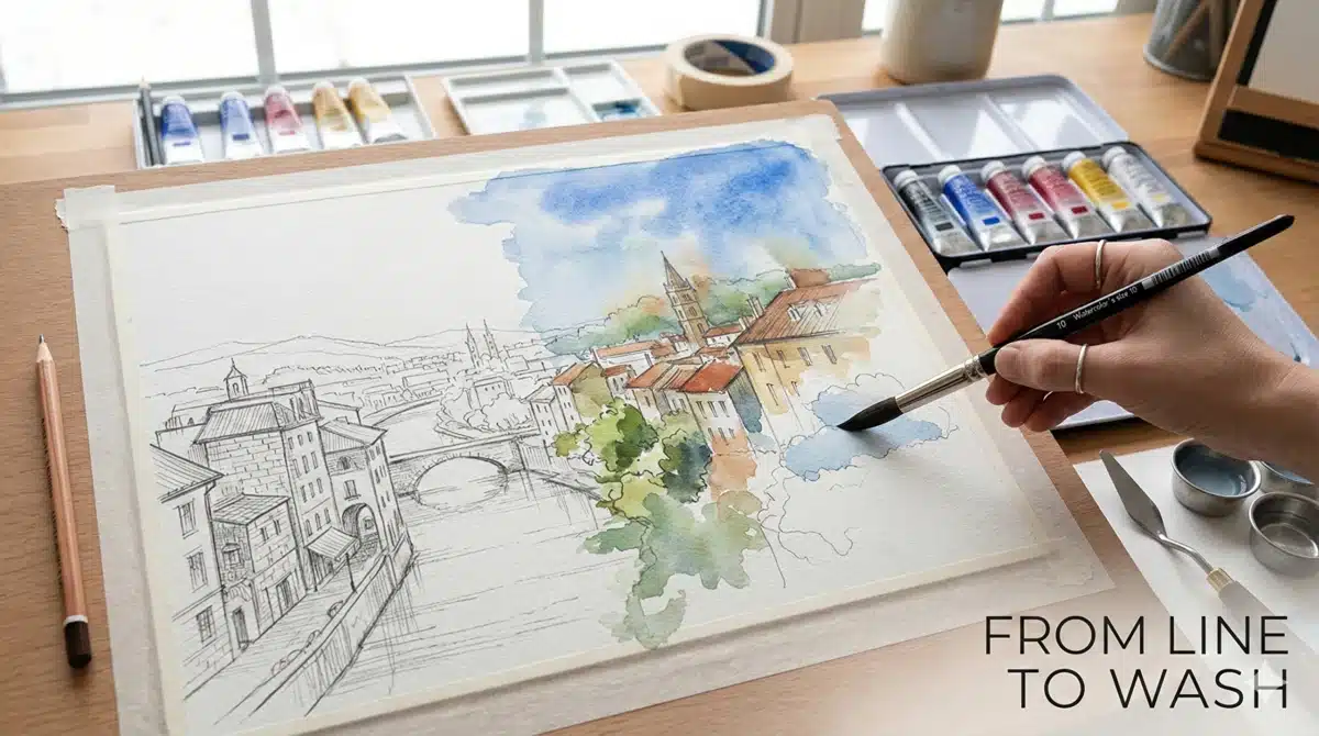
From Sketch to Wash: Integrating Drawing and Watercolor
Introduction: Why Start with a Drawing?
Many watercolor artists begin not with a blank sheet, but with a drawing—rough or precise—that acts as a roadmap. A good sketch can:
Clarify composition and proportions before you ever touch the paper with water.
Reduce anxiety by giving you a plan.
Let you focus on color, value, and edges while painting instead of constantly correcting drawing mistakes.
At the same time, you don’t want the drawing to stiffen the painting. Watercolor’s charm lies in its fluid edges, granulation, and slight unpredictability. The goal is balance: a drawing that supports you, but doesn’t choke off spontaneity.
This guide walks you through that journey—from choosing the right drawing, to getting it onto watercolor paper, to layering washes over it with confidence.
I. Selection and Surfaces
1. Choosing the Right Drawing to Paint
Not every sketch is a good candidate for watercolor. Some are better left as drawings, and that’s okay. When you look through your sketchbook, ask:
Does this drawing have clear, readable shapes?
Can I imagine a few simple value layers (light, mid, dark)?
Is there a pleasing arrangement of large, medium, and small shapes?
Does it have an emotional pull or story I’ll enjoy revisiting?
Watercolor thrives on clarity and simplification. A drawing that’s overloaded with tiny details in every corner will be hard to translate into clean, luminous washes. Instead, look for: Strong silhouettes, Clear focal area, Enough open space for washes to breathe. If you’re unsure, do a quick thumbnail value study in pencil or diluted watercolor to test how it might read as a painting.
2. Paper Matters: Picking a Surface for Your Painting
When you move from sketch to watercolor, the paper itself becomes a crucial “partner.” Core considerations:
Weight: 140 lb / 300 gsm is standard; fine for most work. Heavier papers (200–300 lb / 425–640 gsm) buckle less and are ideal if you use large washes or don’t want to stretch.
Texture (surface): Hot-pressed: smooth, great for fine line drawings and detail. Cold-pressed: a versatile, slightly textured surface loved by many illustrators and painters. Rough: pronounced tooth, great for expressive textures but can make tiny ink lines break up.
Sizing: Most quality watercolor papers are internally and externally sized, which controls absorbency and helps washes stay workable.
Choose reputable brands; cheap paper can fight back, making it harder to lift or glaze. A practical default: a 140 lb (300 gsm) cold-pressed sheet from a reliable brand. It’s friendly to both graphite and ink and works with a wide range of styles.
3. Deciding Where to Draw: On the Same Sheet or Transfer Later?
You have two main options for integrating drawing and painting: Draw directly on the watercolor paper or sketch elsewhere, then transfer the drawing. Each has pros and cons.
3.1. Drawing directly on watercolor paper
Pros: Fast and straightforward. No distortion from transfer. You respond more directly to the actual painting surface.
Cons: Harder to correct big compositional mistakes. Risk of overworking the surface if you erase heavily. Graphite can get ground into the paper if you fiddle too much.
This approach works well if: You’re comfortable with drawing accuracy, the subject is simple, and you enjoy a looser, more intuitive process.
3.2. Drawing elsewhere and transferring
Pros: You can refine composition and proportions without damaging the painting surface. You can re-use the same drawing for multiple variations. The watercolor paper stays clean and fresh.
Cons: Extra step and time. Requires some method (lightbox, window, graphite transfer, or grid). If the drawing is complex (architecture, portrait), or if you plan a series from the same sketch, transferring is often worth it.
II. Transfer Methods and Tools
1. Ways to Transfer Your Drawing to Watercolor Paper
Several tried-and-true methods work well; choose based on your equipment.
1.1. Lightbox or sunny window
If your watercolor paper is not too thick and your drawing is bold: Tape the original sketch to the lightbox or window. Tape the watercolor paper on top, aligning edges or marks. Use a sharp pencil to lightly trace the lines onto the watercolor paper.
Pros: Very direct, minimal distortion. No extra materials needed beyond tape and light source. Cons: Harder with heavy or very textured paper. Requires decent light and a stable setup.
1.2. Graphite transfer
Good when the paper is too thick to see through. Place tracing paper over your original drawing and trace the line work. Flip the tracing over and rub graphite (soft pencil) over the back of the lines. Turn it right-side up, place it over the watercolor paper, and retrace on top with firm pressure. A light graphite version of your drawing transfers to the watercolor sheet.
Pros: Works with any paper thickness. Lets you adjust placement and scale. Cons: Graphite can be smudgy if overdone. Lines can be darker than you want if you press too hard.
1.3. Grid method
Useful for scaling up or making proportional adjustments. Draw a grid over the original sketch (e.g., 2×3, 4×5 squares). Draw a proportional grid lightly on the watercolor paper. Copy the drawing square by square, focusing on big shapes. Erase grid lines gently when done.
Pros: Great for accuracy without tracing. Helps train your eye for proportion. Cons: Time-consuming. Grid lines must be erased carefully to avoid damaging the surface.
2. Pencil, Ink, or Watercolor Pencil? Choosing Your Line
Your choice of drawing tool affects the final look and how it interacts with washes.
2.1. Graphite pencil: Widely available and forgiving. HB or F for light construction; 2H–4H for very faint lines. Softer leads (B, 2B) are darker but smudge more. Tips: Keep lines light and economical; avoid heavy shading. Use a kneaded eraser to lift, not rub, to protect the paper surface. Expect some graphite to show through transparent washes; this can be a feature or a flaw depending on your style.
2.2. Waterproof ink: If you love line work, waterproof ink is a strong option. Use waterproof fineliners, technical pens, or dip pens with waterproof ink. Let ink dry fully before painting, or it may still smear. Watercolor over ink keeps the linework crisp and readable. Pros: Clear, graphic lines that stay put under washes. Great for urban sketching, comics, and illustration. Cons: Lines can dominate if too heavy or mechanical. Mistakes are harder to hide than with pencil.
2.3. Non-waterproof ink: Some artists paint first, then add ink lines afterward. This can give looser, more expressive results. The paint becomes a color “sketch” you respond to with line. It’s less about “drawing → painting” and more about a conversation between them.
2.4. Watercolor pencils: Watercolor pencils are a clever hybrid: they draw like colored pencils but dissolve with water. You can sketch lightly, then let the lines melt into washes as you paint. If you choose pencil colors that match your planned paint colors, they integrate seamlessly. Pros: Less visible drawing lines in the final piece. Good for grid drawings, as the grid can wash away or blend into the painting. Cons: You can’t fully erase once activated. Requires a bit of practice to predict how much the pencil marks will show.
III. The Painting Process
1. Planning Values and Color Before You Paint
A finished watercolor isn’t just a colored version of your line drawing. The shift from drawing to painting is really about values and edges. Before painting: Identify your lightest lights—often preserved as untouched paper. Decide where your mid-value washes will unify shapes. Mark your darkest accents—they should be used sparingly but powerfully. A quick value sketch (even 3 tones: light, mid, dark) helps preview how the drawing will translate into a painting. If you prefer digital planning, you can also scan or photograph the drawing and do a rough value/color plan on a tablet before committing to the paper.
2. First Wash: Establishing the Light
Many watercolorists approach painting over a drawing in three broad phases: Light wash (or “first pass”), Mid-value and shape definition, and Dark accents and details. In the first wash: Mix dilute colors for large areas: sky, background, main local colors. Stay lighter than you think; it’s easy to darken later, hard to regain lights. Drop in color variations wet-in-wet to keep it lively. Key point: avoid “coloring inside the lines” mechanically. Allow paint to slightly bleed and mingle; the drawing remains your guide, not your prison.
3. Building the Second Layer: Form and Structure
Once the first wash is dry: Identify forms that need more definition. Add mid-value washes to separate planes (e.g., front vs. back objects, light side vs. shadow side). Simplify: instead of outlining everything, let shadows and value shifts suggest edges. This is where your drawing starts transforming into painting. The lines are still there, but you’re increasingly relying on shape and value.
Tips: Glaze transparent color over large areas to shift temperature (e.g., a warmer glaze on sunlit side, cooler on shadow side). Keep some edges soft (lost) where forms roll, and some sharp where you want crisp separation.
4. Final Pass: Dark Accents, Edges, and Possible Re-Drawing
In the last stage: Add darkest darks sparingly in focal areas. Strengthen essential edges if they’ve become too diffused. If you like, re-emphasize or redraw some lines with ink or a darker pencil. Some artists intentionally let the drawing almost disappear under washes, using it only as a scaffolding. Others keep the line as a prominent feature, especially in ink-and-wash illustration. This final pass is also a good time to add texture (dry brush, splatter) that complements the original drawing marks.
IV. Strategies and Troubleshooting
1. Managing the Drawing Itself While Painting
A few practical points to keep the drawing from becoming a problem: Avoid heavy erasing after the drawing is on watercolor paper; it damages the surface sizing and causes patchy washes. If graphite lines look too strong, lightly lift them before painting with a kneaded eraser. With ink, always test waterproofness on a scrap of the same paper before committing. If you’re worried about visible pencil, watercolor pencils or very light H/HB pencil can reduce leftover line visibility in the final painting.
2. Example Workflow: Urban Sketch → Watercolor
Scenario: You have a pen sketch of a café façade in your sketchbook and want to turn it into a finished watercolor piece.
Refine the sketch: On tracing paper, simplify clutter (extra signs, cars) and clarify main shapes (door, windows, human figures).
Transfer to watercolor paper: Use a lightbox or window to trace the cleaned-up version lightly in waterproof ink or pencil onto cold-pressed paper.
First wash: Lay in sky and light wall colors with very dilute washes, letting some color run into the pavement area for unity.
Second layer: Add mid-values to windows, door recesses, and cast shadows. Keep figures mostly as silhouettes with minimal detail.
Final details: Darken window interiors, add signs or lettering with a fine brush or pen. Strengthen a few important ink lines (door frame, café sign), leaving others faint.
3. Example Workflow: Graphite Portrait → Loose Watercolor
Scan or photocopy the drawing: This preserves the original and gives you freedom to experiment.
Transfer lightly to watercolor paper: Use a grid, lightbox, or graphite transfer, keeping lines minimal.
Underpainting: Wash in skin tones broadly, ignoring small details; maintain highlights as white paper.
Form modeling: Add mid-values to define planes (forehead, cheeks, jaw). Use cooler mixes for receding areas (shadow side), warmer for advances (light side).
Accents and possible re-drawing: Add darkest darks in the eyes, nostrils, mouth corners, hair accents. Optionally reinforce key contours with a colored pencil or subtle ink line.
4. Common Problems When Moving from Drawing to Watercolor
Problem 1: The painting looks stiff and over-outlined. Causes: Heavy, rigid linework; over-reliance on the drawing. Solutions: Use lighter pencil or finer ink lines; allow some edges to dissolve; practice a “paint-first, draw-later” exercise.
Problem 2: Pencil smudges and muddies washes. Causes: Dark, soft pencil; aggressive scrubbing. Solutions: Switch to harder pencils (HB, F, 2H); lift excess graphite; use watercolor pencils.
Problem 3: The drawing disappears completely under paint. Causes: Drawing too light; too many opaque washes. Solutions: Decide line importance early; use ink if needed; reintroduce line afterward.
Problem 4: Transfer method distorted the drawing. Causes: Skewed tracing; paper shifting. Solutions: Use registration marks; tape both drawing and watercolor paper securely.
V. Mastery and Conclusion
1. Practice Exercises to Build Confidence
Exercise 1: One Drawing, Three Color Treatments: Take a simple line drawing. Transfer it onto three sheets. Paint with a high-key palette, strong shadows, and experimental colors.
Exercise 2: Draw in Watercolor Pencil, Then Paint: Sketch lightly in watercolor pencil and let lines melt into washes.
Exercise 3: Paint First, Draw After: Start with loose watercolor underpainting and add line selectively once dry.
2. Finishing, Presentation, and Protecting Your Work
Once your watercolor is dry: Erase any still-visible pencil construction lines gently. Flatten the sheet if needed by pressing between clean boards. Sign discreetly. For presentation: Use a mat that leaves some breathing room. Avoid direct sunlight. If you worked heavily over a delicate drawing, note what went well and what didn’t.
Learn how to properly seal and prime raw wood panels for acrylic and oil painting. Step‑by‑step instructions on using Golden Gloss Medium, applying gesso, sanding, and preventing yellowing and warping.
Struggling to pick between watercolor, acrylic, or oil? Learn how drying time, control, and personality traits like patience and pace determine which paint medium is the best fit for you.
Learn what linseed oil does in oil painting, the different types available, how to use it safely with the fat-over-lean rule, and when to keep your mixtures simple.
Learn what “fat over lean” really means in oil painting, why it prevents cracking, and how to apply it step‑by‑step using modern mediums, ratios, and practical examples for stable, long‑lasting…
Stuck in perfectionism or artist’s block? Learn how to use sandpaper, wire brushes, scraping, and distressed gesso as “surface alchemy” to reveal layers, add depth, and free up your painting…
Optimize your art studio for comfort and long‑term wellness. Learn ergonomic design principles and habits to protect your back, neck, and wrists during long creative sessions.
Discover how artist varnish protects oil and acrylic paintings from dust, UV light, and aging. Learn when and how to varnish, gloss vs satin vs matte, removable varnishes, and long‑term…
1. Invisible Armor: How to Protect Your Artwork Online Through Watermarking and Copyright Control 1.1. The Hook: The Digital Mirage You upload a painting you spent weeks perfecting—a swirl of…